Welcome to the wonderful world of inter-war Streamline Moderne.
A branch of Art Deco (a reaction to it, some argue), Streamline Moderne grew from industrial styling practices of the 1930s. It can be recognised by its smoothed surfaces (with few sharp edges), curves, bullet shapes, fins and fluting. Everything that Streamline Moderne touched looked as though it was designed to go at about a million miles an hour. The designers who first employed Streamline Moderne styling were stripping away some of the more decorative elements of Art Deco in favour of something based on the latest scientific ideas about speed and motion, and streamlining; looking to form rather than decoration. This was the age of the first commercial airliners, don’t forget. Streamline Moderne’s other parent was the sea, and in particular the great ocean liners. In Streamline Moderne, you can see the seeds of Modernism, but thanks to TV programmes like ITV’s Hercule Poirot series (non-UK readers might be more familiar with the buildings in Capra’s Lost Horizon or Fleming’s Wizard of Oz) Streamline Moderne is what most people think of when you say Art Deco, which was actually a much broader church.
Streamline Moderne was the industrial design motif that made its way absolutely everywhere. You could find it on the high seas (and some Streamline Moderne buildings looked like they had washed up from the high seas themselves as they replicated the rounded decks of ocean liners), on the high street, in hotels, and in the home. Even cigarette lighters succumbed: see about halfway down this page, but not until after you’ve finished this article in case you don’t make it back from the V&A’s display of streamlined gorgeousness.
Still with me?
Bang in the middle of the 1930s (1935 to be precise), the UK’s LNER (London and North Eastern Railway) scored a massive publicity coup with the unveiling of its streamlined A4 Class, employed on crack express trains between London and Scotland. It was shockingly different from conventional locomotive appearance. It was like nothing railway passengers in Britain had ever seen, and it generated massive interest (especially when one of the A4s later achieved the highest authenticated speed ever recorded by a steam locomotive). Even today, the surviving members of the class still turn heads. The LNER’s bitter rival, the LMS (London, Midland and Scottish Railway) was forced to follow suit, and two years later it unveiled its streamlined Coronation Class locomotive, also employed on London-Scotland express trains. And so started one of the occasional, and ultimately futile, Anglo-Scottish speed wars between the two railways. The look of these streamliners was a key element in the publicity efforts that surrounded each company’s offering. And they are, quite simply, beautiful. Forget for a moment that some people think it’s nerdy to like trains (you probably have, if you’re a regular reader) and just enjoy them for the sublime pieces of industrial design they are. These are machines which have made the world a more beautiful place in which to live. Fact.
![A4 Class "Bittern" on the Severn Valley Railway. By Hugh Llewelyn from Bristol, UK (4464Uploaded by Oxyman) [CC-BY-SA-2.0], via Wikimedia Commons](https://thebeautyoftransport.files.wordpress.com/2013/05/hugh_llewelyn_4464_6883896782.jpg)

In America too, plenty of streamlined locomotives could be found. Like this one. My actual favourite train ever. This is the J3a Class, designed to pull the New York Central Railroad’s 20th Century Limited.
![By Robert Yarnall Richie (1908-1984) [see page for license], via Wikimedia Commons](https://thebeautyoftransport.files.wordpress.com/2013/05/hudson_locomotive_for_the_new_york_central.jpg)
Industrial designer Henry Dreyfuss (1904-1972) was employed by the NYC to create a Streamline Moderne locomotive and carriages for the 20th Century Limited (following on from his successful work on the company’s Mercury services, also in the Streamline Moderne style), and they were introduced in 1938. Just as in Britain, the NYC’s streamliner was deployed to devastating effect in publicity material (and to think that long distance train travel in the US is now completely marginalised…).
![By Leslie Ragan / New York Central System (?) [Public domain or Public domain], via Wikimedia Commons](https://thebeautyoftransport.files.wordpress.com/2013/05/new_york_central_20th_century_limited_1938.jpg)
The irony is that although these streamliners looked modern, the streamline styling was actually mere window dressing on what was essentially an obsolete technology: conventional steam locomotives. In mainland Europe, the railways were already investing in a genuinely modern technology and electrifying at a staggering pace, ensuring they survived the coming decades in much better shape than Britain’s railways (privations of war aside).
In Britain, meanwhile, as the LNER and LMS were battling to provide the fastest streamlined train service to Scotland (and nearly coming off the rails once or twice by all accounts), the remaining two of the “Big Four” railway companies were taking a different approach. The GWR (Great Western Railway) loved its traditional-looking (or old-fashioned, depending on your perspective) locomotives, all green paint and brass and copper bits. Its one experiment with streamlining a locomotive was utterly farcical, and I might do it as a Beastly Transport at some point, just for the fun of it.
But Art Deco hit hard elsewhere within the company – in the shape of an Art Deco logo which appeared in odd places like station benches, and in the Streamline Moderne form of its diesel railcars for branch lines. This was Streamline Moderne clothing something which actually was somewhat modern. Goodness knows what 1930s passengers must have made of it when, one morning, instead of a small GWR tank engine and a couple of elderly coaches wheezing into the station, the future suddenly glided in. They must have thought they were about to be abducted by extra-terrestrials and taken aboard this rocket ship.
![GWR railcar at the STEAM Museum in Swindon. By Tim Walker [CC-BY-2.0], via Wikimedia Commons](https://thebeautyoftransport.files.wordpress.com/2013/05/1024px-1934_gwr_diesel_railcar.jpg)
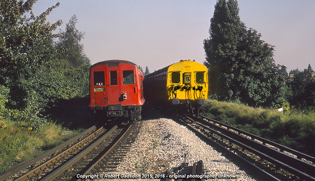
The last of the Big Four was the Southern Railway. Its long distance services connected London with the West Country. It was a late adopter of streamlining, with its Merchant Navy class not appearing until the early 1940s. The look of the Merchant Navy locomotives wasn’t really something you could define as Streamline Moderne, but then again their designer Oliver Bulleid was never interested in following others’ trends. In any case, the Southern’s main business was the commuter market into London, and this made up the vast majority of its passengers. While all that Streamline Moderne was on show on railways all over the place in the rest of the country, and in fact the rest of the world, this is what the Southern’s passengers saw when a new fleet of trains began operating on the Portsmouth-London via Guildford route in 1937 (it remains a key commuting line to this day).
![A London-Portsmouth express at Weybridge station. Ben Brooksbank [CC-BY-SA-2.0], via Wikimedia Commons](https://thebeautyoftransport.files.wordpress.com/2013/05/1024px-weybridge_station_geograph-2386531-by-ben-brooksbank.jpg)
Oh, the humanity! Not Streamline Moderne. Not Art Deco. Arguably, not styled at all (although even that is a styling choice).
But the Southern’s trains didn’t need to look modern, because they actually were modern. Unique amongst its British contemporaries, vast parts of the Southern’s operation were electrified, including most of the lines covering its core London commuting business. The London-Portsmouth line received the trains above in 1937 because it too had just been electrified.
And though the Southern’s trains were little more than carriages with windows cut in the end and some cables plonked on, the company had its eye elsewhere when it came to Streamline Moderne. If its trains weren’t going to look modern (because they already were) then something else sure as hell was. And next week, I’ll tell you what.

.jpg)
I think that to say all of the Southern’s EMU stock was lacking stylistically is a little bit unfair. The 4-COR (Portsmouth Line) units were about the worst of the bunch, but the almost-contemporary 2-HAL units have something about them which seems to make them fit better with the Moderne architecture –


Perhaps it’s the curved-corner windows that do it… And the domed front-end of the roof, though that’s a hangover from LSWR EMU stock.
On the subject of EMUs, I’m not sure whether they’re any more aesthetically pleasing, but Bulleid’s attempts at EMU design seem to have a rather more modern look to them –
I think I prefer the LT CO/CP stock really.
My favourite, I think, must be the original 4-SUB unit, with the front-end shared with the 2-HAL, but incorporating Bulleid’s distinctive curve-ended toplights on the doors –
That said, I’m forgetting Bulleid’s attempt at tube stock…
Not up to the standards of LT’s 1938TS, but still… Interesting.
And, sure enough, I’ve probably sent someone to sleep with all this twaddle…