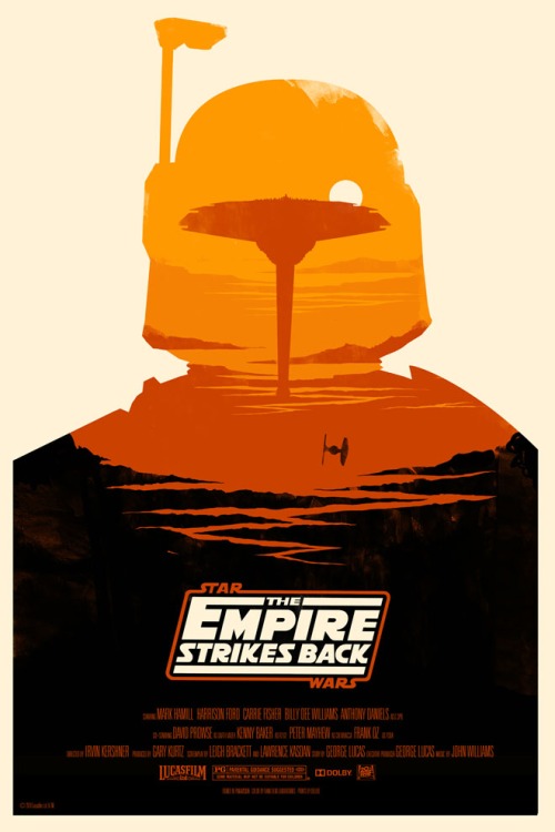
For my image analysis I have chosen Olly Moss’ Star Wars The Empire Strikes Back Film Poster. It was designed as a three-part series of the original Star Wars trilogy that he created for collectible art house Mondo.
The idea was to use a key recognisable character from the film as a silhouette, then the detailing inside was created with a key location from the film. In this example it is Boba Fett created out of Cloud City.
The typography has a very retro feel, mimicking the original logos. The colour scheme is very simplistic with a nice layered gradient yet this is very striking when it is placed within the silhouette layout capitalising on the white space around the page.
The main design choice made by Moss, was to create the design using a screen printing technique instead of reproducing it digitally. This decision would have proved very difficult as there are four layers of ink to make the perspective gradient effect for the scenery. It was a very brave choice to use screen printing as it is a trial and error method as it doesn’t go perfectly every time. Although when it doesn’t go as you intended sometimes the result can work out better. Like in this example the top of his helmet the print failed to be a solid shape, yet it has a rustic effect that fits the character well.
